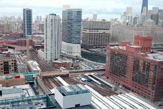
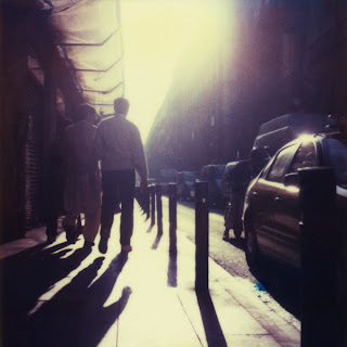
Our site is a triangular shaped lot just outside of the loop of Chicago and is bordered by the canal that cuts through the city and large apartment buildings.
In-between the water large white and glass apartment and red apartments, (car park)
The one million sq.ft. museum that we are charged with producing is split into three board topics, Making, Living, Cultural. What I found compelling and thought could produce an interesting architecture was the idea of plans and the paths that they produced.
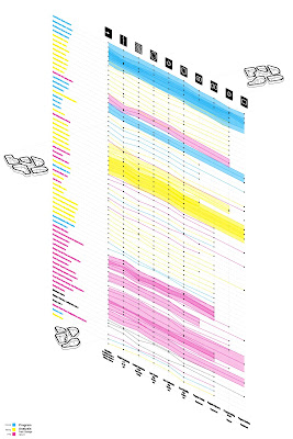
This started by collecting 100 museum plans from the exciting to the mundane, selecting spaces that had dynamic paths produced by their architecture and splitting them up into large, medium and small spaces to accommodate the different types of program.
Plan analysis
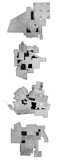
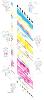
With the plans collected, mapping how one travels through the specific spaces was the next. Looking at the example of the Chicago Cultural Center specifically how elements of irrational plan can produce meandering though a space and what happens when different agendas overlap.
Path analysis
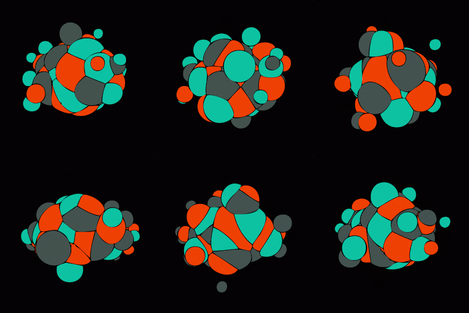
Adding programmatic elements into the found plans and paths leads to an arrangement of 8 different areas one for each school [Architecture, Photography, Painting, Ceramic, Fiber, Print, Metal, and Sculpture] These areas were arranged sectionally through the structure creating cores of spaces that related to each field. i.e. An architecture cinema, painting museum, or metal working housing.
Program + Plan Series
In plan this produces an archipelago of architecturally imbued areas that allow the user to move between floors while also creating shortcuts thought the generic plan.
Site Plan + 4th Floor Plan
The general critique was about the section and skin because due to the fact that it was a midterm review neither of these have been fully developed. I'll throw them in here but they are just a start.
Exterior Render + Longitudinal Section
